Svelte Component
The simplest guide to generating your first static OG image using svelte component.
Prerequisites
Ensure, Vite/Rollup Plugin configuration as described in the Getting Started.
Guide
We will create the simplest possible Open Graph image. This example uses a Svelte component without any dynamic data fetching or complex logic.
Create your Component
Component should use standard HTML and CSS (or utility classes from Tailwind CSS). Ensure the component's root element has a style of width: 100% and height: 100% to correctly fill the rendering area defined in the options.
Important
If using style blocks, you must enable CSS injection in svelte options.
<svelte:options css="injected" />
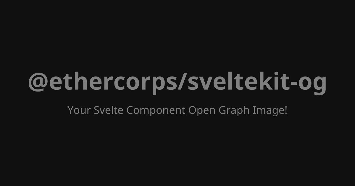
		<div
	style="display: flex; flex-direction: column; justify-content: center; align-items: center; width: 100%; height: 100%; background-color: #101011;"
>
	<h1 style="color: gray; font-size: 80px; margin: 0;">@ethercorps/sveltekit-og</h1>
	<p style="color: gray; font-size: 36px; margin-top: 20px;">
		Your Svelte Component Open Graph Image!
	</p>
</div>
Create API route
Create a SvelteKit server route (a +server.ts file) and use the ImageResponse constructor to render your component. For this basic setup, we include only the mandatory configuration: the component, dimensions, and necessary fonts.
		import { ImageResponse } from '@ethercorps/sveltekit-og';
import SimpleCard from '$lib/components/og/simple.svelte';
import type { RequestHandler } from '@sveltejs/kit';

// This is optional, use it if you want to generate OG image at build time.
export const prerender = true;

export const GET: RequestHandler = async () => {
	return new ImageResponse(
		SimpleCard, // ⬅️ Pass the Svelte component here
		{
			width: 1200,
			height: 630
		}
	);
};
Preview
Visit the URL corresponding to route in browser (e.g. http://localhost:5173/images/simple.png).
Using Vanilla CSS
The examples above use Style attribute. However, you can also use standard CSS within Svelte Component <style> block or use Tailwind CSS.
Important
If using style blocks, you must enable CSS injection in svelte options.
<svelte:options css="injected" />
		<svelte:options css="injected" />

<script>
	// component props
</script>

<div class="card">
	<h1>Hello World</h1>
</div>

<style>
	.card {
		display: flex;
		background-color: white;
		height: 100%;
		align-items: center;
		justify-content: center;
	}
	h1 {
		font-size: 60px;
		color: black;
	}
</style>
Next Steps
- Types Reference: For a full overview of all options and parameters for
ImageResponse, see Types reference guide. - Local Assets: To include local images or other assets in OG images, see Local Assets guide.
- Custom Fonts: To use fonts other than the default, see Fonts guide for detailed instructions.