GitHub Repository OG Image
Recreate the iconic GitHub repository social card using dynamic data and Svelte components.
Overview
In this example, we will recreate the iconic GitHub repository Open Graph image. This involves:
- Fetching live data from the GitHub API.
- Loading custom fonts (Inter) to match the brand.
- Rendering a Svelte component that visually mimics the design.
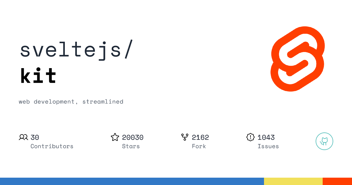
Target Design:
Code Implementation
The Visual Component
Svelte component handles the layout. It receives data via props and uses Tailwind classes (via class attribute) for styling.
		<svelte:options css="injected" />

<script lang="ts">
	import Star from 'phosphor-svelte/lib/Star';
	import Contributors from 'phosphor-svelte/lib/Users';
	import Fork from 'phosphor-svelte/lib/GitFork';
	import SealWarning from 'phosphor-svelte/lib/SealWarning';
	import GithubLogo from 'phosphor-svelte/lib/GithubLogo';

	type Props = {
		logo: string;
		owner: string;
		repo: string;
		description: string;
		contributors: number;
		open_issues: number;
		stars: number;
		forks: number;
	};

	const { open_issues, owner, forks, repo, stars, description, contributors, logo }: Props =
		$props();

	const details = [
		{
			title: 'Contributors',
			count: contributors,
			icon: Contributors
		},
		{
			title: 'Stars',
			count: stars,
			icon: Star
		},
		{
			title: 'Fork',
			count: forks,
			icon: Fork
		},
		{
			title: 'Issues',
			count: open_issues,
			icon: SealWarning
		}
	];
</script>

<div class="flex flex-col w-full h-full bg-white">
	<div class="flex flex-col w-full h-[96%] px-16 pt-20 pb-10">
		<div class="flex flex-row items-center justify-between w-full h-1/2">
			<div class="flex flex-col w-1/2 items-start">
				<span class="text-gray-800 text-7xl leading-1.5">{owner}/</span>
				<span class="text-7xl font-bold">{repo}</span>
			</div>
			<img class="h-full" src={logo} />
		</div>
		<div class="flex flex-row w-[55%] mt-2">
			<span class="text-xl text-gray-600 leading-1.5 tracking-wide">{description}</span>
		</div>
		<div class="flex flex-row items-center justify-between w-full h-1/2">
			{#each details as detail (detail.title)}
				<div class="flex flex-row">
					<detail.icon class="w-8 h-8" />
					<div class="flex flex-col ml-2">
						<span class="text-gray-900 text-2xl">{detail.count}</span>
						<span class="text-gray-600 text-xl">{detail.title}</span>
					</div>
				</div>
			{/each}
			<div class="flex flex-row border-2 border-[#57bfbb] p-3 rounded-full">
				<GithubLogo class="w-8 h-8" color="#57bfbb" />
			</div>
		</div>
	</div>
	<div class="flex flex-row w-full h-7">
		<span class="flex bg-[#3178c6] w-9/12"></span>
		<span class="flex bg-[#f1e05b] w-2/12"></span>
		<span class="flex bg-[#ff3e00] w-1/12"></span>
	</div>
</div>
The API Route
Server endpoint ties everything together. It handles the request, fetches the data, loads the fonts, and returns the generated image.
		import { ImageResponse } from '@ethercorps/sveltekit-og';
import { error, type RequestHandler } from '@sveltejs/kit';
import {
	getRepoDetails,
	type RepoDetailsError,
	type RepoDetailsResponse,
	cache,
	type RepoContributorsResponse
} from './api.js';
import { tryCatch } from '$lib/try-catch';
import type { ImageResponseOptions } from '@ethercorps/sveltekit-og';
import OgComponent from '$lib/components/og/github-repo.svelte';
import { fontsData } from '$lib/fonts-utils.js';
import type { ComponentProps } from 'svelte';

export const GET: RequestHandler = async ({ url }) => {
	const details = {
		owner: url.searchParams.get('owner') ?? 'etherCorps',
		repo: url.searchParams.get('repo') ?? 'sveltekit-og'
	};

	const cacheKey = `${details.owner}/${details.repo}`;
	let data = cache.get(cacheKey);

	if (!data) {
		const { data: response, error: githubError } = await tryCatch<
			{ repo: RepoDetailsResponse; contributors: RepoContributorsResponse },
			RepoDetailsError
		>(getRepoDetails(details));
		if (githubError) {
			error(githubError?.response?.data?.status || 500, {
				message: githubError?.response?.data?.message
			});
		}
		if (response && response.repo.data) {
			data = { ...response.repo.data, contributors_count: response.contributors.data.length };
			cache.set(`${details.owner}/${details.repo}`, data);
		}
	}

	const props: ComponentProps<typeof OgComponent> = {
		owner: data?.owner.login as string,
		repo: data?.name as string,
		description: String(data?.description),
		contributors: data?.contributors_count as number,
		forks: data?.forks as number,
		open_issues: data?.open_issues as number,
		stars: data?.stargazers_count as number,
		logo: data?.owner.avatar_url as string
	};

	const imageOptions: ImageResponseOptions = {
		width: 1200,
		height: 630,
		debug: false,
		fonts: await fontsData(),
		headers: {
			'Cache-Control': 'no-cache, no-store'
		}
	};

	return new ImageResponse(OgComponent, imageOptions, props);
};
Data Fetching Helper
A simple utility to fetch repository details (stars, forks, issues) from the GitHub API.
		import { Octokit } from 'octokit';

export const cache = new Map<
	string,
	RepoDetailsResponse['data'] & { contributors_count: number }
>();

export type RequestDetailsParams = {
	repo: string;
	owner: string;
};

const octokit = new Octokit();

export type RepoDetailsResponse = Awaited<ReturnType<typeof getRepoDetails>>['repo'];
export type RepoContributorsResponse = Awaited<ReturnType<typeof getRepoDetails>>['contributors'];

export type RepoDetailsError = {
	response: {
		data: {
			status: number;
			message: string;
		};
	};
} | null;

export async function getRepoDetails(details: Required<RequestDetailsParams>) {
	const repoRequest = octokit.request(`GET /repos/{owner}/{repo}`, {
		owner: details.owner,
		repo: details.repo,
		headers: {
			'X-GitHub-Api-Version': '2022-11-28'
		},
		...{
			cf: {
				cacheTtl: 60 * 60, // 1 hour,
				cacheEverything: true
			}
		}
	});

	const repoContributors = octokit.request(`GET /repos/{owner}/{repo}/contributors`, {
		owner: details.owner,
		repo: details.repo,
		headers: {
			'X-GitHub-Api-Version': '2022-11-28'
		},
		...{
			cf: {
				cacheTtl: 60 * 60, // 1 hour,
				cacheEverything: true
			}
		}
	});

	const [repo, contributors] = await Promise.all([repoRequest, repoContributors]);

	return {
		repo,
		contributors
	};
}
Fonts Config
To get the authentic look, we load the Inter font family (Regular and Bold) using Google Fonts.
		import SpaceRegularFont from '$lib/assets/fonts/SpaceMono-Regular.ttf';
import SpaceBoldFont from '$lib/assets/fonts/SpaceMono-Bold.ttf';
import type { ImageResponseOptions } from '@ethercorps/sveltekit-og';
import { read } from '$app/server';

export type FontWeight = 'regular' | 'bold';

const fontsUtils: Record<FontWeight, string> = {
	regular: SpaceRegularFont,
	bold: SpaceBoldFont
};

const fontWeight: Record<FontWeight, number> = {
	regular: 400,
	bold: 700
} as const;

const fetchFont = async (weight: FontWeight, file: string) => {
	return {
		data: await read(file).arrayBuffer(),
		name: 'Neon',
		weight: fontWeight[weight],
		style: 'normal'
	};
};

export const fontsData = async () => {
	let fontsData: ImageResponseOptions['fonts'] = [];
	const fontsPromise = [];
	for (const [key, value] of Object.entries(fontsUtils)) {
		fontsPromise.push(fetchFont(key as FontWeight, value));
	}

	const fontsResponse = await Promise.all(fontsPromise);
	fontsData = fontsResponse.filter((font) => font !== undefined) as ImageResponseOptions['fonts'];
	return fontsData;
};
Live Preview
Start your development server and visit the URL below. Change the owner and repo query parameters to generate cards for different repositories instantly in playground.

Playground
Experiment with the component props directly in the browser:
 Preview link: /images/github?owner=sveltejs&repo=kit